Map: Where Poverty & Test Scores (Don't?) Intersect In Indianapolis

Kyle Stokes / StateImpact Indiana
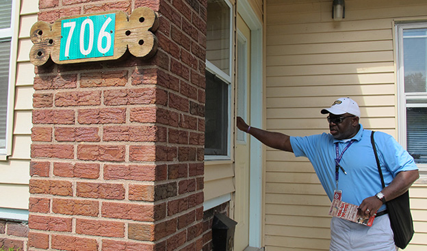
Henry Jordan, a dean at George Washington Community High School, knocks on the door of a home on Indianapolis' Near Eastside in July 2012. Jordan, an Indianapolis Public Schools employee, was part of a team canvassing the city looking to encourage IPS dropouts to re-enroll.
Backed by several major players on the Indianapolis education scene, a report released Wednesday outlined 11 portions of Marion County where — the authors conclude — students are in desperate need of better access to “high-quality” schools.
Researchers from IFF, a non-profit financial institution, urged local officials to improve existing schools or launch newer, better schools in these 11 “Priority Areas,” which span portions of seven of Indy’s 11 school districts.
But the study’s authors come to an interesting conclusion: the 11 “Priority Areas” are also not necessarily the city’s poorest.
To explain, let’s take a look at some maps.
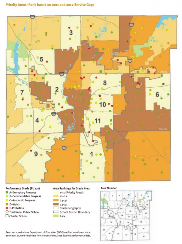
First, the “Priority Areas” themselves, which include portions of MSD Pike Township, MSD Wayne Township, MSD Decatur Township, MSD Perry Township, MSD Warren Township and Indianapolis Public Schools. The small colored circles indicate district public schools; the small colored boxes indicate charter schools. The red markers indicate schools that received F’s from the state last year. The big, bold numbers demarcate the “Priority Areas” on this map, from 1-11:

Screenshot of IFF Report / 2007-11 U.S. Census Data; 2011 IDOE Data
A map from included in the IFF report "The Shared Challenge of Quality Schools," which identifies what it calls 11 "Priority Areas" of Indianapolis. The report urges local school officials and city officials to open new schools in those areas to close gaps between the number of students in those geographic areas of the city and the number of "high quality" seats available for those children.
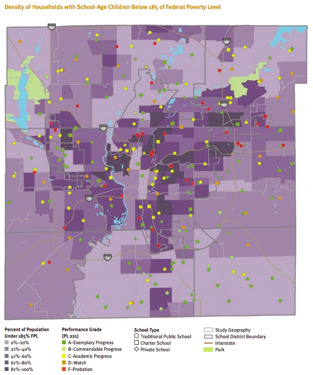
Now, compare that map to a map of poverty in Indianapolis. The darker the shade of purple, the more households in that area making less than 185 percent of the federal poverty level. Again, the circles indicate public schools; the squares, charters; the red markers, F’s. Notice how the “Priority Areas” don’t exactly line up with the areas of the city where poverty is at its highest levels:

Screenshot of IFF Report / 2007-11 U.S. Census Data; 2011 IDOE Data
The IFF report says those areas do not correspond with areas of high poverty.
Although the Priority Areas have slightly higher rates of low-income households, that data does not support the conclusion that low-income households and underperforming schools correspond. In mapping schools by performance and type against the distribution of poverty, [the data show] high-performing schools throughout the city, across most neighborhoods. Speedway, in particular, has neighborhoods with high concentrations of low-income households and high-performing schools.
The study’s authors say in four of the “Priority Areas,” less than a third of students live in poverty. But in four other “Priority Areas,” well over half of students live in poverty.
Several superintendents in Marion County have already expressed their skepticism about the IFF report’s findings, tweets Indianapolis Business Journal education reporter J.K. Wall:
Marion County supers: IFF study is old news based on flawed A-F grades; merely reflects socioeconomic disparities. ow.ly/d/17b5
— J.K. Wall (@jkibj) March 13, 2013
The Joyce Foundation and Walton Family Foundation funded the study. Among those who advised the study’s authors are supporters of charter schools and Indiana’s voucher program. Representatives for the Indianapolis Mayor’s Office, The Mind Trust, Stand for Children, the University of Indianapolis and other groups fill out the report’s Study Advisory Committee.
==
UPDATED, 4:40 pm: Pointing to this Answer Sheet post outlining flaws of a similar study in Washington, D.C., the superintendents of all 11 Marion County school districts issued a joint statement to express concerns about the IFF report’s conclusions:
The methodology used is based on the A-F Grading Model, a flawed system that is currently under revision at the Indiana Statehouse. This model does not take into account the richness of diversity that school districts in urban areas like ours so passionately embrace. The study breaks the city into 42 geographic areas, ranking them according to the number of “seats” available. Dividing Indianapolis into geographic areas does nothing more than highlight disparities in income and educational attainment level. It is not an indication of the quality of education available.
The superintendents point out each Marion County district offers “some form of choice that allows parents the opportunity to select the best ‘seat’ for their child.” (You can read their statement in full here.)
==
What do you think of the findings? While the report is Indianapolis-specific, would a similar study of other Indiana communities find school performance and poverty “don’t necessarily correspond”?


